Choosing the right acrylic colors for your artwork
Choosing the right acrylic colors for your artwork can make a significant difference in the final result. With so many options available in the market, it can be overwhelming to decide which colors to invest in. In this blog post, we will guide you through the process of selecting the right acrylic colors for your needs. From understanding the different types of acrylic paints to considering factors such as opacity, permanence, and color mixing, we will provide you with all the information you need to make an informed decision.
Introduction
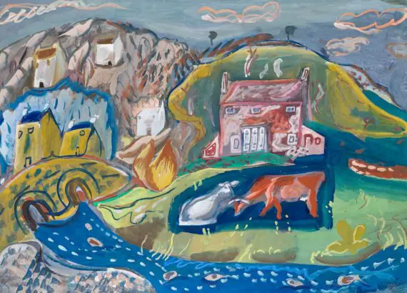
Acrylic painting is a popular medium among artists due to its versatility and vibrant colors. It’s a medium that allows for a wide range of techniques and styles, from thick, textured applications to thin, watercolor-like washes. The quick-drying nature of acrylics also makes them ideal for layering and creating complex compositions. However, with so many acrylic colors available in the market, it can be overwhelming while choosing the right acrylic colors for your artwork. The sheer variety of hues, shades, and brands can leave even the most experienced artist feeling a bit lost. In this article, we will discuss some tips for selecting the right acrylic colors for your artwork, along with some techniques and mediums to enhance your acrylic paintings. We will delve into the importance of understanding color theory, starting with a limited palette, and considering the opacity and transparency of colors.
I. Tips to choose right Acrylic colors

1. Consider the Color Wheel
The color wheel is a useful tool for artists to understand color relationships and create harmonious color schemes.It is a graphic representation of colors arranged in chromatic order. When choosing acrylic colors for your artwork, it is essential to consider the color wheel and choose right colors that complement each other. You can choose colors that are opposite each other on the color wheel for a bold and contrasting effect, or colors that are next to each other for a more harmonious and subtle look. Understanding the color wheel can also help you avoid creating muddy colors when mixing.
2. Start with a Limited Palette
When starting with acrylic painting, it can be tempting to buy a wide range of colors. The allure of a rainbow of tubes of paint can be hard to resist. However, starting with a limited palette of primary colors (red, blue, and yellow) and white is recommended. With these colors, you can mix a wide range of hues and shades, giving you more control over the color intensity and value in your artwork. Starting with a limited palette also helps you understand color mixing better and can lead to a more cohesive look in your paintings.
3. Consider the Opacity and Transparency of Colors
Acrylic colors come in various opacities and transparencies, which can significantly affect the final look of your artwork. Opaque colors are more solid and can cover underlying layers, while transparent colors allow the layers underneath to show through. When selecting acrylic colors, consider the opacity and transparency of each color and how it will affect your painting. Understanding the difference between opaque and transparent colors can help you create depth and volume in your paintings.
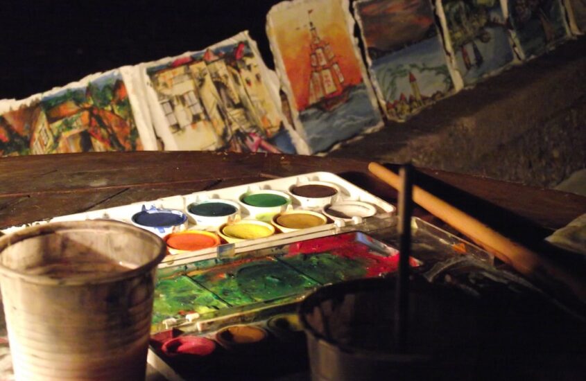
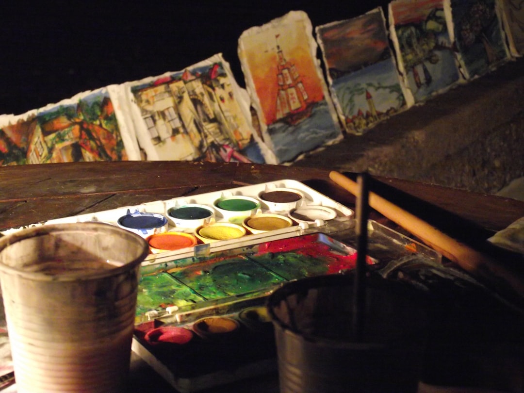
4. Test the Colors on a Palette
Before applying the colors to your canvas, it is always a good idea to test them on a palette. This will give you a better idea of how the colors will look when mixed and applied to your artwork. Additionally, you can try the colors on a scrap of paper or canvas to see how they blend and how they appear after drying. Color testing can also help you understand how different colors interact with one another, how they change when mixed, and how they seem in different lighting circumstances.
5. Consider the Brand and Quality of Acrylic Colors
There are many brands of acrylic colors available on the market, and it can be challenging to choose the right one. It is essential to consider the quality of the acrylic colors, as it can significantly affect the final result of your artwork. Cheaper acrylic paints might contain less pigment, which would make them less vibrant and have a shorter lifespan. For the best results, it is advised to spend money on premium acrylic paints from reliable manufacturers. A higher pigment concentration in high-quality acrylics will produce more vibrant colors and a longer lifespan. They will also have smoother consistency and better lightfastness, ensuring that your artwork remains vibrant for a long time.
II. Acrylic Techniques

Acrylic painting offers a wide range of techniques that can be used to create different effects and textures in your artwork. These techniques can help you express your creativity and bring your artistic vision to life. Here are some popular acrylic techniques that you can try:
1. Wet-on-Wet Technique
The wet-on-wet technique involves applying wet paint on top of another layer of wet paint. This technique is great for blending colors and creating soft, smooth transitions. It is essential to work quickly with this technique as the paint dries fast. The wet-on-wet technique can also be used to create a sense of movement and fluidity in your paintings, making it ideal for painting landscapes, seascapes, and other scenes where you want to convey a sense of motion.
2. Dry Brush Technique
The dry brush technique involves using a dry brush to apply paint on top of a dry layer of paint. This technique is great for creating texture and adding details to your artwork. It is recommended to use a stiff-bristled brush for this technique. The dry brush technique can be used to create a variety of effects, from creating the texture of fur and feathers in animal paintings to adding highlights and details in still life and landscape paintings.
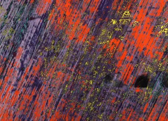
3. Splatter Technique
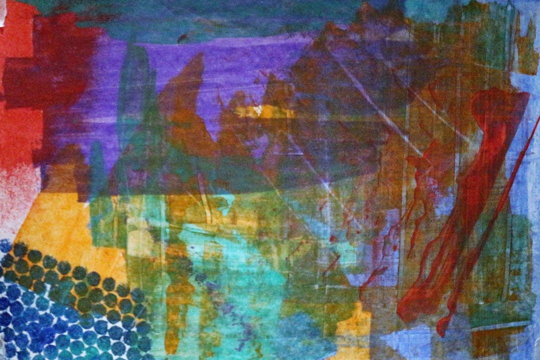
The splatter technique involves flicking or splattering paint onto the canvas to create a random and abstract effect. This technique is great for adding texture and movement to your artwork. You can use a toothbrush or a stiff-bristled brush to achieve different splatter effects. The splatter technique can add a sense of spontaneity and energy to your paintings, making it ideal for abstract artworks and backgrounds.
4. Sgraffito Technique
The sgraffito technique involves scratching or scraping off layers of paint to reveal the layers underneath. This technique is great for creating texture and adding depth to your artwork. You can use a palette knife or a pointed tool to achieve different effects with this technique. Sgraffito is a technique that can be used to achieve a wide range of effects, such as adding depth and dimension to abstract artworks or giving tree bark and rock textures in landscape paintings.
III. Acrylic Mediums
Acrylic mediums are additives that can be mixed with acrylic paint to alter its properties and create different effects. They can enhance the versatility of acrylics, allowing you to create a wide range of textures and effects. Here are some popular acrylic mediums that you can use in your artwork:
1. Gloss Medium
To make acrylic paint more transparent and give it a glossy appearance, mix gloss media, a clear, glossy medium, with the paint. It’s wonderful for making glazes and adding depth to your artwork. Gloss medium can also be used to create a shiny, reflective surface, making it suitable for painting water, glass, and other reflective surfaces.
2. Matte Medium
Matte media is a clear matte medium that can be used to remove shine and produce a matte impression with acrylic paint. It’s great for giving your artwork a smooth, silky finish. Matte medium can also be used to give a soft, diffused look, making it ideal for portraiture, still life, and other subjects that require a soft, muted tone.
3. Texture Medium
Texture material is a thick, paste-like medium that you may mix with acrylic paint to give texture and complexity to your artwork. It’s wonderful for adding texture and impasto effects to your paintings. Texture media can be used to create a wide range of textures, from rough stone and bark to smooth skin and fabric.
4. Retarder Medium
Retarder media is a medium that dries slowly and can be used with acrylic paint to extend its working time. It is excellent for color blending and producing seamless transitions in your artwork. In order to employ acrylics to get a watercolor-like look, retarder medium can also be used. This enables you to produce supple washes and delicate transitions.
Conclusion
Choosing the right acrylic colors for your artwork is crucial for achieving the desired result. By considering the color wheel, starting with a limited palette, and testing the colors before applying them to your canvas, you can create harmonious and vibrant paintings. Additionally, experimenting with different acrylic techniques and mediums can add depth and texture to your artwork. With these tips and techniques, you can create stunning acrylic paintings that showcase your creativity and style. Remember, the key to successful acrylic painting lies in understanding the medium, experimenting with different techniques, and most importantly, enjoying the process. Happy painting!